1. Open Variant Styling
From the Create tab, select Variant Styling.
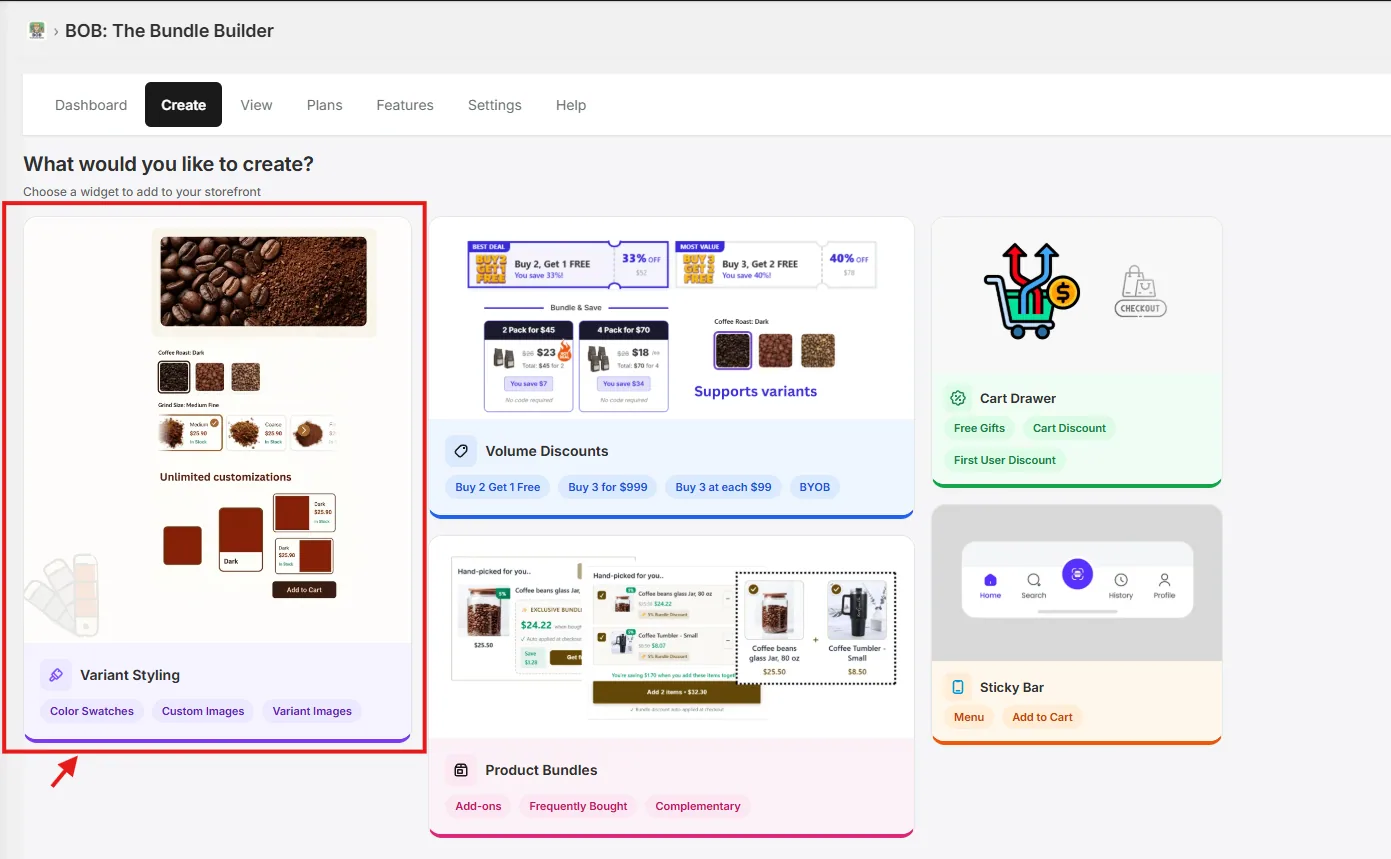
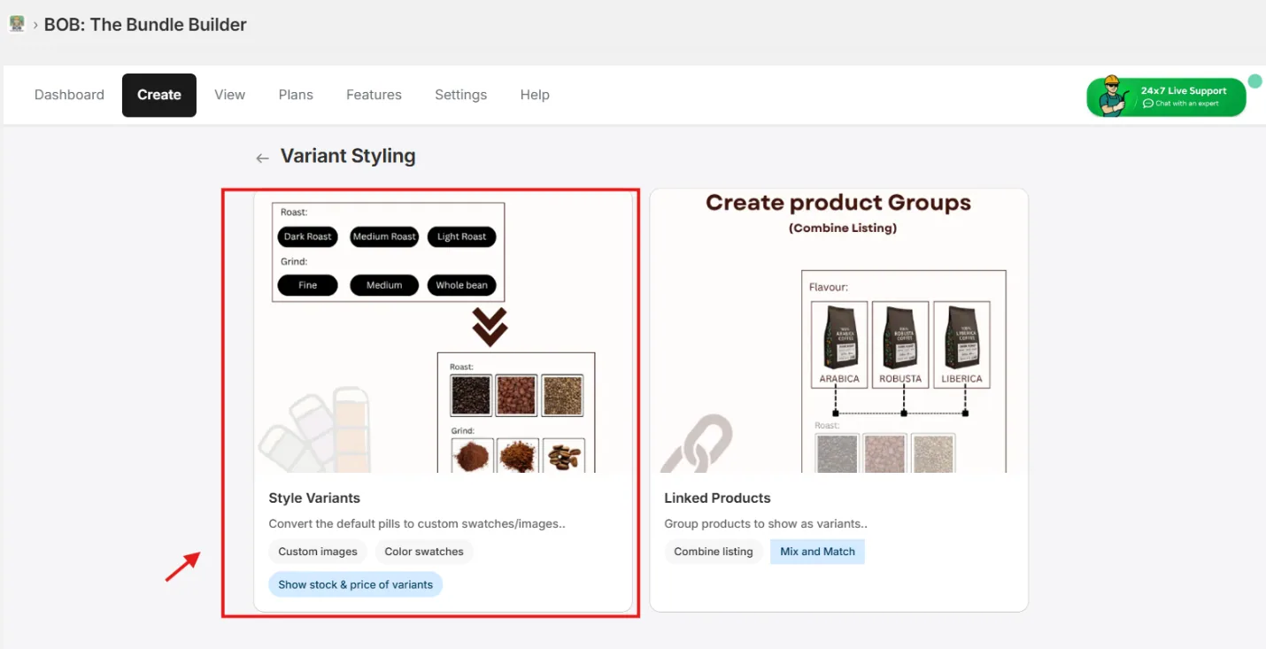
2. Pick a flow
Choose Style Variant Picker and proceed to select products.
FYI: You can also explore Combine Listing (Native) to create a combined listing of custom product groups.
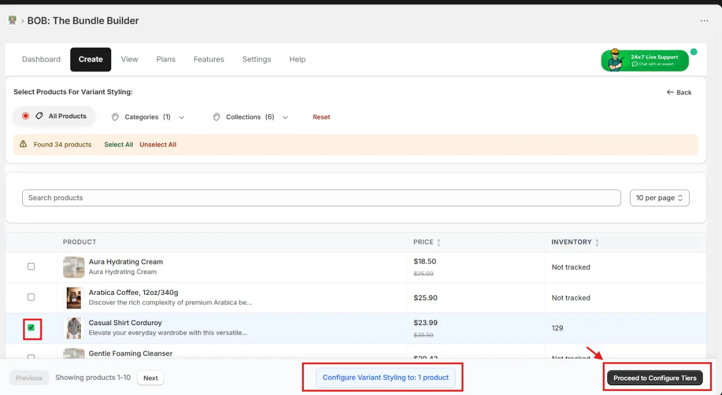
3. Select the products
Pick the set of products whose variants you want to style.
Pro-Tip: Combine all products that share similar variants in a single pass — use the Collections / Categories filter and click Select All.
4. Configure variant display
Inside the config page, pick your variant first — for example Color or Style — then choose its corresponding display style. BOB supports Custom Images, Color Swatches, Dropdown, and sync with product variant images.
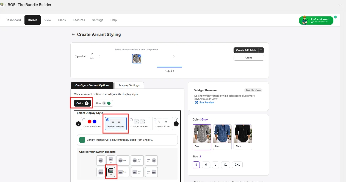
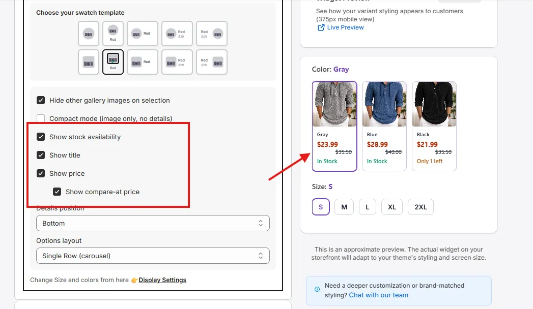
Customize the template further to adjust what's shown (price, stock, etc.) and its alignment to match your store's UX.
Pro-Tip: Use the Inline layout for 6 or fewer options (better mobile UX); use Carousel for larger option sets.
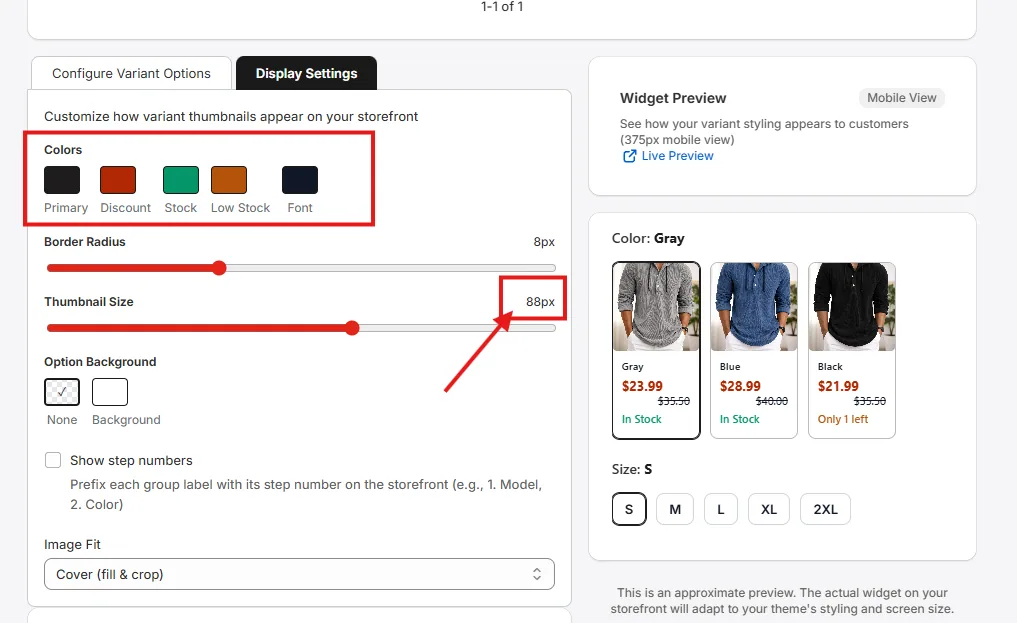
5. Style to match your theme
From the Display Settings tab, configure colors and sizes to match your storefront theme.
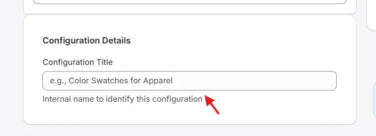
6. Name the configuration
Set a title for the configuration — this is required so you can find it from the View page later.
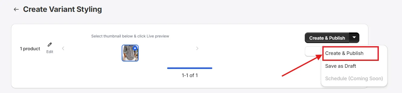
7. Save or publish
Click Save as Draft to keep the configuration in draft mode, or Create & Publish to make the widget appear live on the storefront.
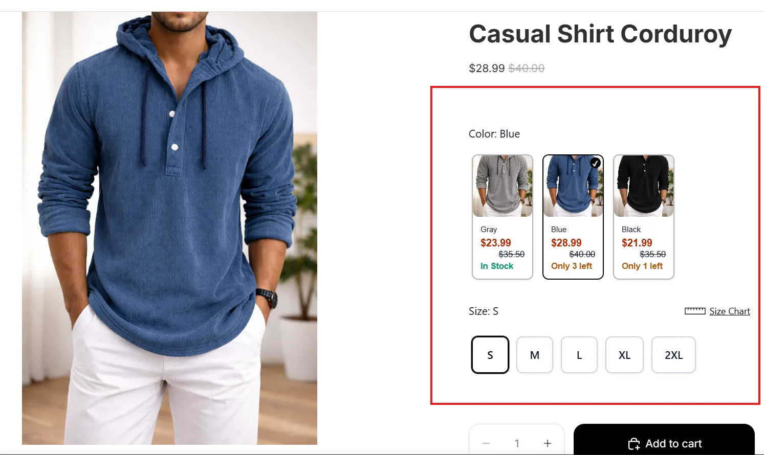
8. Preview on the storefront
After publishing, use the Live Preview link under Widget Preview to see the product page with your variant styling widget.
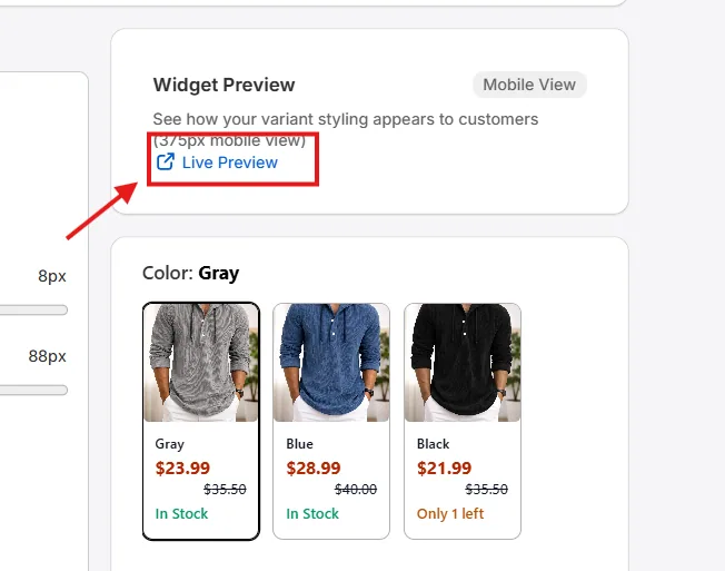
Depending on your configuration, the widget will appear similar to the one below — replacing your store's native variant picker.
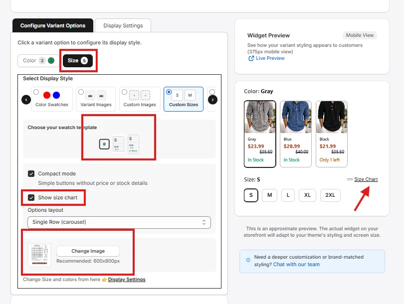
Custom size charts
To set a custom size chart, select the corresponding size variant and choose Custom Sizes in the display style. Click Change Image to replace the default size chart with your own, and publish.
Pro-Tip: Show prices next to custom sizes when each size has different pricing — it improves pricing clarity and speeds up decisions, which often improves conversion.